Wednesday, November 3, 2010

In Situ

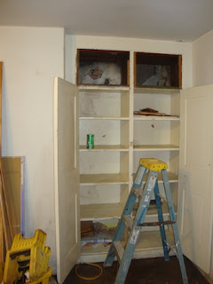
Pavilion IX is undergoing a comprehensive renovation.  The Office of Facilities Management and the Office of the Architect are updating the electrical, heating, cooling and other systems.  In the process of making way for the new, you sometimes find vestiges of the old.  Take a look at this cupboard in the basement of the Pavilion.


Now take a closer look at the top two shelves of the cupboard. What do you see?  The back of the shelves look a little different, they're not painted like the rest of the cupboard.  What's in there?  The Architectural Conservator for the University had some ideas, but asked me to take a look.
The back of the cupboard has wallpaper that just might be original to the building.  A curator that I consulted had this to say: "The wallpaper is an ashlar block design which was very popular during the first half of the 19th century. They were frequently used as dado papers below the chair rail, or in the entry way to suggest solidity and grandeur."  

Since this paper is in the back of a cupboard it might be a scrap that is left over from an installation in another part of the building that no longer survives.  The paper extends behind the frame of the cabinets, so we can only speculate whether it was placed to decorate the back wall of the cabinets or the cabinets were placed over the wallpaper as part of the changing function of the 
room.  

But the plan is to leave the wall paper in place, "in situ" and just mend the torn edges so the remnants don't become more tattered.  Research on the history of the buildings is ongoing and new information is gathered every time a building is renovated or altered.  By leaving the wallpaper in situ, we ensure another opportunity for examination and research that might match up with some other detail about the building that is revealed years down the road.  

Tuesday, October 12, 2010

Collating


Before you take a book apart to clean and mend the pages, re-do the sewing and provide a new binding, you've got to collate it.  Modern books have page numbers to keep everything in order, but back in the good old days, conventions were different; the preface, dedication, introduction might be numbered with lower case Roman numerals or not at all.
the signature is noted with an "A", the catchword corresponds to the first word on the next page


 "And" bottom left corresponds to "And" on the top right
The main text might have page numbers, but more often there would be letters to mark the signatures, and catchwords to help the printer and binder keep everything in order as the book was being printed and assembled.
Plates also add another layer of complexity, sometimes they are numbered sequentially, and sometimes the printer comes up with another system.  In this instance the plate is numbered according to the page it is supposed to be facing, which is a great idea, I just have to make a note as to which page the plate is actually bound with.


Books are made up of many, many moving parts that need to fit together and while page numbers and signature marks may seem like enough to re-assemble all the pieces, it is better to be safe than staring at a pile of sheets and loose plates going hmmm....
do you see the quill from someone cutting a new point?

So, collating, in the conservation context, is a precise documentation of how each page fits into the overall sequence and structure of a book. It can seem a little painstaking to some, but I enjoy it.  It is a great way to commune with a book that I am about to work on, learn something new, and notice all sorts of little details and surprises.

Tuesday, October 5, 2010

up and running!

Remember when the only thing I had in the lab was the fume trunk? my first post!

Well, it's got some company now and I'm busy getting a bunch of posters done for an exhibit on government documents. This poster had a ton of masking tape residue on the back and needed a lot of solvent work to remove it. It will be much better off when it's done and the trunk has been a big help. And I love these benches, I can work on all sides of the poster, round and round mending edge tears.

I find it a little amusing that as a book conservator, my first big show here is all about flat paper, but stay tuned for the next exhibit project, it's a book and I have bought a special nifty tool for the fixing!

Thursday, September 23, 2010

It's nice to have two

We have an exhibit on the 100th anniversary of Government Documents opening in October.  Gov Docs may not seem like a sensational topic, but we have a great collection of posters from World War I to put on display.  And while the images and design are amazing, the posters were not printed on the best paper and have suffered over the years. 

The poster on the right has some big pieces missing or detached, while the poster on the left has tears and plenty of masking tape residue on the back.  Right now, I'm thinking that the one on the left will turn out better, but it is nice to have two.

Tuesday, August 10, 2010

on the road

I do make house calls on occasion and last month I went to the Central State Hospital to help get their archives in order. The collections needed a little help as the staff planned to re-house everything for better storage and since they don't have an archivist or a conservator on staff I was happy to help.


There were many panoramic photographs of graduating classes from the nursing school. Panoramic photographs have a tendency to roll themselves into very tight tubes if they are not stored properly. It is possible to slowly and gently humidify the photos, and when they've relaxed significantly, you can flatten them under blotters and weights.
Using a clear container for your humidity chamber is ideal so you can see what is going on and don't forget about what you have in the chamber. It is a long process, but then you can work on other things while the panoramas take their time.

These photos only needed a little bit of mending. I had brought tissue and methyl cellulose and as it turns out, laptops make nice handy weights, when it is time to dry a mend.

It was a long day, but it is fun to get out and see other collections, help other people and think on your feet!

Tuesday, August 3, 2010

Iron Gall Ink

This is a great example of what iron gall ink can do to paper.  Can you see through the loss in the signature to the following page? 

It is also a great example of the difference in the stability of the two inks, the iron gall ink which was the predominant writing ink for many, many centuries.  And carbon black printing ink which was used in the days of movable type.

Iron gall ink is an acidic ink which worked really well when scribes were writing on parchment.  Parchment is a relatively thick and tough writing surface and the acid would sink into the parchment and make a very permanent, dark mark  Depending on how the ink was made (recipes abound) the ink could be more or less acidic.  This didn't matter so much as long as the writing or drawing was on parchment, but then the world switched to paper as the predominant writing surface and the ink proved too aggressive.


Iron gall ink is of significant importance to the conservation community because of its prevalence in archival documents, manuscripts and works of art. The ink corrosion website is one site that documents history and research related to this topic. 

Many different recipes were used over the years, and the stability of the ink varies according to the writing surface, storage conditions and handling.  Most book and paper conservators will have to make treatment decisions based on the condition of the iron gall ink they're dealing with.  In some instances, the ink is stable, and sometimes it has eaten through the paper.  There's the permanence of the written word and then there's permanence of the ink.

Tuesday, July 27, 2010

out last week


I didn't post last week because I was at Rare Book School, taking the course "The American Book in the Industrial Era 1820-1940". What a week! We covered quite a time span, from the days of handmade paper, handmade type and hand bound books, right through the mechanization of the whole publishing process.

One of the really great things about Rare Book School is their teaching collection. It is one thing to read about the different types of paper, printing processes etc. but having examples on hand makes such a difference.


The plate on the right is a steel engraving, while the plate on the left is commonly called a wood engraving, even though it is actually a relief printing process. They're both made by hand. This particular wood engraving was used for an illustrated newspaper (see the sample just above it), while the steel engraving was probably for a book.


And then there's Lucille...Rare Book School has approximately 400 copies, that span over 30 years of publishing. For this class we looked at a little over 20 copies to get a sense of how the book changed in cover design but the publisher regularly re-used the same plates to print the text.

There were enough books to hand around so each student could make their own discovery about different editions or issues.
Intense and fun!


Friday, July 9, 2010

one of these things is not like the others

This is a group of diplomas and a certificate that I recently treated. The certificate on top is paper while the others are parchment. The paper document is from 1939, while the parchment documents are 1921, 1918, 1916 and 1915. They are not too far apart in age, have been boxed together as part of the same collection and underwent the same treatment for similar issues, but what a difference in aging.

Friday, July 2, 2010

not all stickers stick the same

Things change, especially in libraries. Books that were acquired in 1963 for the general collections have matured into rare books. The gorgeous publisher's cloth bindings, the scarcity of these titles in their original cover and their significance as milestones in their subject area are all factors in the transition to special collections.

Which means it is time to get the barcode stickers off the front cover. It can be done, but not all stickers stick the same. You've got to be ready for things to go smoothly like the two dark green books that had the same type of sticker, (the plastic carrier lifted nicely as did the residual adhesive when I applied a vinyl eraser) or not so smoothly as with the other book that had a different type of sticker (the paper carrier lifted quite readily, but the residual adhesive did not agree with the vinyl eraser). You've got to be ready to adapt your original plan, have another type of eraser on hand, or maybe a scalpel with a curved blade, not the straight blade. And if that doesn't work then be ready to try the hot air pencil, (maybe rolling the adhesive off with a metal spatula or maybe with an eraser) all the while paying close attention to the cloth of the book to make sure you are just lifting the sticker and residual adhesive and not scuffing the cloth or decoration and making a bigger mess.

And try not to cut yourself with the scalpel.

Monday, June 28, 2010

I can fix this


Required reading for my Rare Book School class The American Book in the Industrial Era 1820-1940

It is in kind of rough shape, detached boards, spine torn at the joints, housed in a phase box...


but I can fix this...


with new end sheets, spine linings and a new cloth spine under the original.


how often do books come back to the circulation desk looking better than when they were checked out? ; )


Tuesday, June 22, 2010

Yes, Joe, paper has grain

The other weekend I had an hour and a half to kill before meeting a friend for dinner, and I thought what a perfect time to cover those four double-fanned adhesive books I made the other week. I had decided that since these books were for my personal collection, I would do a simple cover of marbled paper adhered to the boards and spine. I love marbled paper and had some handy.

Of course, it's summer in Charlottesville, the window A/C unit in my apartment is doing the best it can, but it is still really humid. So when I went to check the grain direction of my paper to make sure it would align with the boards and spine of the book, the paper was very floppy and it was very hard to tell which way the grain was going. I posted my frustration on Facebook, got some sympathy and also a question from a non-conservator friend "Paper has grain?". Yes, Joe, paper has grain. It is one of the first things you learn about when you start to work with books. Paper folds easiest parallel to the grain, and can create problems when you try and flex it across the grain. When binding books, especially with machine made paper you always want to make sure the grain direction of your paper and board is in line with your spine, if all the grain is aligned, all the pieces of the book will work together.

You can test for yourself. Take a piece of paper from a printer or photocopier and fold it over (but don't crease it!) along the short side, with your hand on the curve, give the paper a little bounce and feel how much resistance the paper gives back.


Now turn the paper and fold it over along the long side, with your hand on the curve, give the paper a little bounce and feel how much resistance the paper gives back. Was it more or less than the other direction? Feel free to turn the paper and try the other direction again. In my example, the paper gives less resistance when folded over on the long side, so it is "grain long".


As it turned out, the marbled paper I wanted to use was grain long, which worked well for my project. I was relieved when I applied the glue and the paper started to flex in parallel with the grain which confirmed my guess. Phew!


Saturday, May 8, 2010

the safe arrives


the safe arrives!!!
my last essential piece of equipment, to provide security and fire protection for the collection materials that I am going to be working on.

It's big, it's heavy, and it's got to get from the loading dock to the lab...


since there were only single-width doorways, the safe had to be moved by people, no room for forklifts,


and I did a lot of research and measuring to make sure that I could get the maximum amount of storage, but the safe would still fit through the door


I think there was a total of seven guys working on this, can you find them all in the picture?


hooray!!!!


Tuesday, April 27, 2010

Old Tools

Sometimes it's nice to get new tools, something shiny and sharp that you get to break in your own self... a new paring knife perhaps.

But sometimes old tools are even better.

I've got a project due around August, it isn't a conservation treatment, but rather a request for a facsimile of a book in our collection.

This project is going to present some fun challenges, and I have started my research already, but the one that is currently at the top of my brain is finding the right tool to represent the blind tooling on the original cover. The tooling on the original is kind of smudgy, as if the tool itself had seen better days. So I can't order something shiny and new, but rather have to look around to see if there is something in my personal collection, or perhaps the collection of another binder that will fit the bill.

This wheel is one of my own and one of my favorites. I love the design but also the signs of the handwork that created it. The stamps on it say "Morris & Co", "Ludgates" and "London". I've glued some test leather to a board and am warming up the stove, stay tuned to see how it turns out!


Tuesday, March 16, 2010

Building a Better Book Cradle- pt 2

So this is the second prototype of the new reading room book cradle. We made the front lip a little deeper even though some people were worried that it might catch the bottom edges as you turn the pages of bound material. That is a possibility, but in general, the square at the bottom of a book's cover should help create enough clearance.

We also made the back edge a little shorter so that the slope of the cradle is about 25 degrees, just enough to help the reader view the book, but not enough to cause a significant amount of text block drag.


The next step is to take this cradle to the reading room for people to use and evaluate, if there's more feedback we'll have a third prototype made, if not, we'll have a bunch of these made for the reading room. Stay tuned!


Monday, March 15, 2010

Linotype

Someone left the Linotype out in the rain...

Saturday, February 20, 2010

Friday, February 19, 2010

Building a Better Book Cradle

All rare book reading rooms need book cradles of some sort. The cradles hold fragile books open at a moderate angle while the researcher takes notes or types on their computer. Ideally, the cradles prevent wear and tear while facilitating use.

There are many different types of book cradles: gray foam wedges; black foam wedges; custom, pose-able cradles made of wood and brass; an ultra-suede "hammock" with a metal frame to name a few. They all work to a certain degree, but the staff at my library were not completely satisfied. The foam wedges come in sets of differing sizes that allow a number of different configurations, however, it is hard to keep track of all the pieces, and they do take up quite a bit of storage space when not in use. Also, if you prop the wedges from the back so the book is tilted toward you while you read or take notes, the book can slide off the cradle or out of its dust jacket or a heavy text-block can sag and stress the joints of the cover. Wooden cradles are not always adaptable to the variety of books that are used in our reading room, and again, they take up a lot of storage space when not in use.

So, how to build a better book cradle that can: support a fragile book at a gentle angle of opening; safely tilt it up a little to make reading and note taking easier for researchers; be flexible enough to accommodate a variety of book sizes; not take up too much storage space; be easily used by staff and researchers?

Well, here's my prototype- a simple Plexi "Z" that tilts the book up at a moderate angle, but has a lip on the bottom to support the text block and cover, and can be used in combination with foam wedges that we already have on hand to support different sized books at varying angles of opening.


The "Z's" by themselves would easily stack on a table in the reading room when not in use. They could also be used for manuscript or any flat documents, again the moderate tilt would facilitate reading and note taking.


I've left the prototype in Special Collections so that the staff can test drive it on a number of books and collect feedback


So far, we think the lip on the bottom needs to be a little deeper
...but what else????